Hero Banner
📍 Find this in the app: Admin Panel → Content → Page Editor (
/admin/page-editor) — drag this block onto any page.
A massive, full-width section typically used at the very top of a page to immediately grab attention.
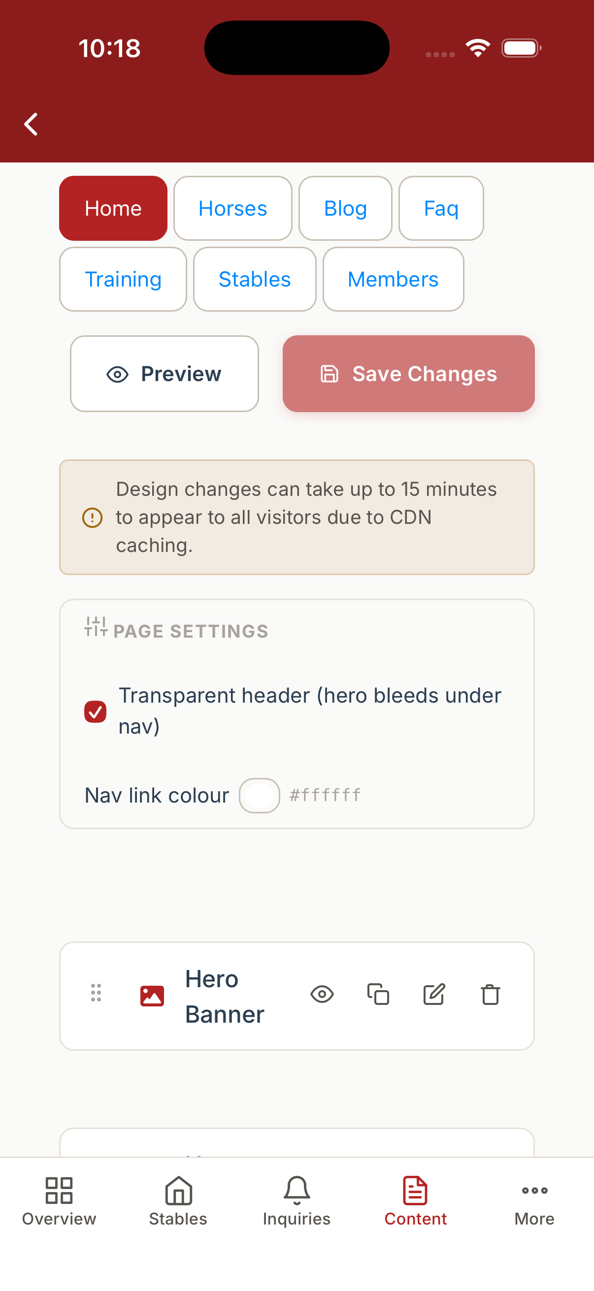
The Page Editor lists every block on a page - reorder, duplicate, preview, edit or delete each one. The example below shows the Hero Banner at the top of the Home page in the native mobile app:
Opening the Hero Banner block reveals its content and layout settings:
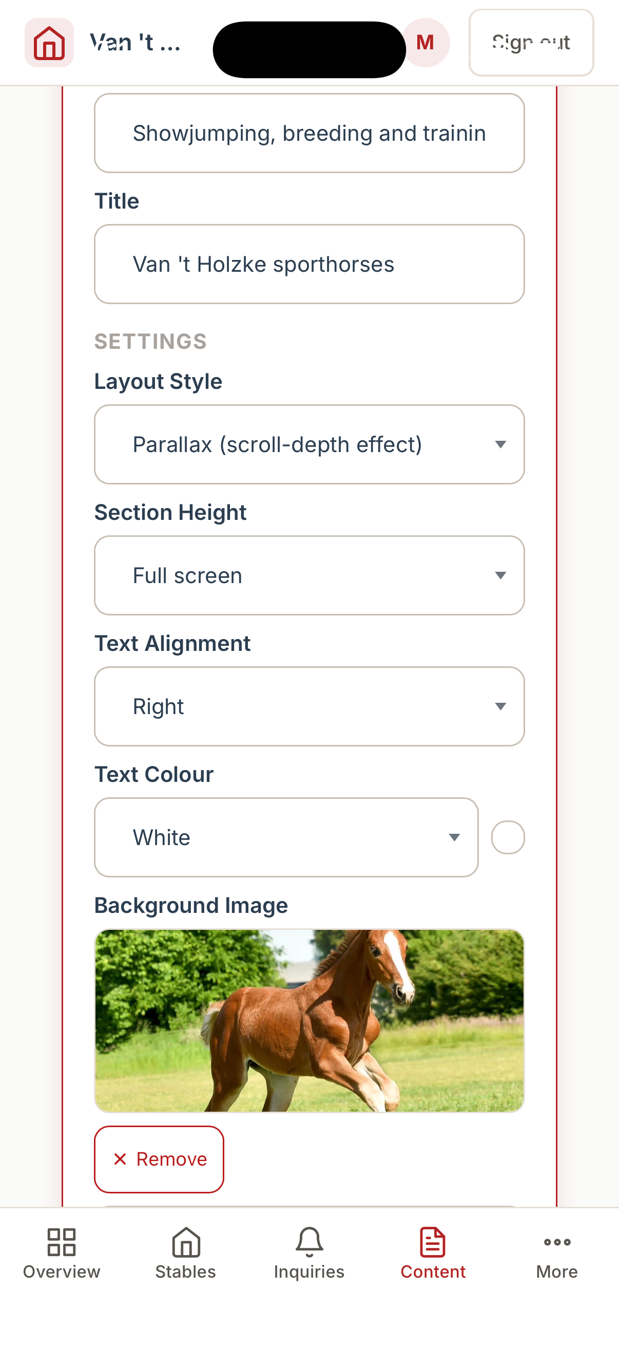
Content
- Title: The main large headline.
- Subtitle: A smaller paragraph below the headline.
Settings
- Layout: Choose how the hero behaves.
overlay: A standard background image with text centered or aligned over it.split: A 50/50 split screen with text on one side and an image on the other.fullwidth: An edge-to-edge layout focusing on wide panoramic images.editorial: A sophisticated, magazine-style layout with overlapping text blocks and background color swatches.cinematic: A dramatic, darkened presentation ideal for highly striking photography.minimal: A clean, white-space heavy layout with subtle imagery.parallax: The background image scrolls at a different speed than the text, creating a 3D depth effect.kenburns: Slowly zooms and pans across multiple background images for a dynamic feel.mosaic: A collage of up to three overlapping images.showcase: Focuses heavily on the subject with an "eyebrow" label above the title.
- Background Image: The main image url.
- Extra Images: Used for multi-image layouts like
kenburnsandmosaic. - Background Overlay: Check to darken the image so text is readable.
- Overlay Opacity: Adjust how dark the overlay is (0-100).
- Height: The vertical size of the banner (
small,medium,large,fullscreen height). - Alignment: How the text is aligned (
left,center,right). - Call to Actions: Toggles to show up to two buttons, with customizable text and links.